The Ultimate Guide to Modern React UI Components: Architecture, Performance, and Design

Mastering React UI: From Concept to Code.
Table of Contents
01. The Evolution of React UI Components
Remember the days of Massive Composed Classes and complex lifecycle methods? React's journey from class components to functional components, and now to the Server Component era, has fundamentally changed how we think about UI.
In 2026, the focus has shifted from "How do I build this component?" to "How do I ensure this component is as lightweight and performant as possible across all edge environments?". We no longer just ship bundles of JavaScript; we ship optimized, pre-rendered, and often headless components that prioritize user experience above all else.
This evolution has led to the rise of specialized collections like React buttons and React data tables that are designed for modularity and performance from the ground up.
02. What Makes a "High-Quality" React UI Component?
A high-quality component is more than just pretty code. It's a balance of several critical factors that senior frontend engineers look for:
- Prop Integrity: Clear, strongly typed props that are intuitive and well-documented.
- State Management: Internal state is minimized, and only what's necessary is exposed via controlled and uncontrolled patterns.
- Theming & Customization: The ability to easily overwrite styles without breaking the fundamental behavior of the component.
- Testability: Components that are easy to isolate and test in tools like Vitest or Playwright.
At IndoUI, we focus on the "Copy-Paste" model because it gives developers full ownership over these quality factors. When you own the code for your React forms, you can ensure they meet your specific data validation and styling needs without fighting a third-party library's limitations.
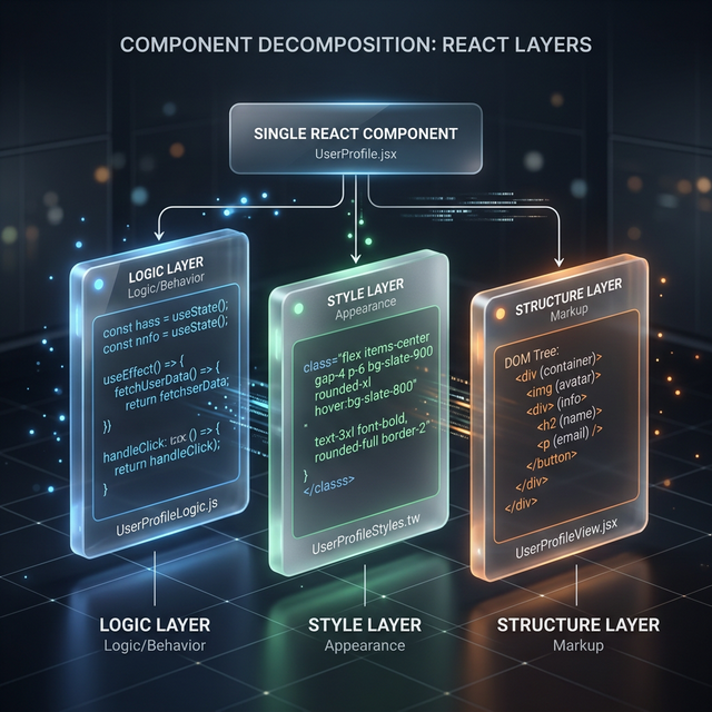
The Layered Approach: Logic, Style, and Structure.
03. Atomic Design in the React Context
Working with atomic design (Atoms, Molecules, Organisms) in React allows teams to scale designs naturally.
Atoms: The Foundation
Atoms are your most basic building blocks—buttons, inputs, labels. They are the individual React UI components that usually don't have dependencies on other components. They are the "purest" form of your design system.
Molecules: Grouping for Purpose
When you combine a Label, an Input, and a Validation message, you create a Molecule. This molecule has a specific purpose—collecting data. This level of abstraction is where most of your mid-level business logic resides.
Organisms: Complex UI Sections
Organisms are high-level sections like a header or a hero section. They are composed of molecules and atoms to create a cohesive experience.
04. Performance Optimization Secrets for 2026
As React applications grow, the "re-render waterfall" becomes a significant bottleneck. Here is how we address it in 2026:
The End of Unnecessary Memoization
With the maturity of the React Compiler, manual useMemo and useCallback usage is decreasing. However, understanding "Stable Props" and avoiding anonymous objects in render is still crucial for high-density components like Analytics tables.
Component Virtualization
For lists or tables with thousands of items, virtualization is mandatory. By only rendering what's in the viewport, we keep the DOM lean and the interactions snappy. This is a core feature in our React table library components.

05. Accessibility: Building for Every User
Accessibility (a11y) is not an "add-on" feature—it's a fundamental requirement.
- Keyboard Navigation: Ensuring every interactive element in a navigation tab is reachable via the TAB key.
- ARIA Attributes: Using
aria-label,aria-expanded, and correct semantic HTML for every dropdown menu. - Focus Management: Controlling where the focus goes when a modal or drawer is opened.
06. The Tailwind CSS Revolution in UI Design
Tailwind CSS has fundamentally changed how we style React components. It eliminates the "Context Switch" between JS and CSS files.
In a modern React component library like IndoUI, we use Tailwind to provide utility-first styling that is highly customizable. This allows developers to build premium UI cards that match their brand with just a few class changes, rather than fighting with complex theme objects.
07. Future Trends: AI-Driven UI and RSC
The future of React UI components is "Smart" and "Hybrid."
AI-Integrated Components
We are seeing components that adapt based on user behavior—buttons that change color if a user seems hesitant (using low-level interaction metrics) or data tables that automatically highlight anomalies.
React Server Components (RSC)
RSC allows us to fetch data directly in the component, eliminating the need for complex state management for many use cases. A feature section can now fetch its own content directly from the DB on the server, shipping zero JS to the client.
Conclusion
Building React UI components in 2026 is an exercise in balancing architecture, speed, and accessibility. By following atomic design principles, leveraging the power of Tailwind, and building for performance, you can create a design system that truly scales.
Frequently Asked Questions
Should I build my own component library?
If your project has unique design requirements and you need full control over performance and a11y, yes. However, using a foundation like IndoUI where you "own" the code but don't have to start from scratch is the most efficient path.
How do I optimize React table performance?
Use virtualization for large datasets and ensure you are not re-calculating expensive operations (like sorting or filtering) on every render. Check our optimized data table guide for more details.
Is accessibility hard to implement in React?
It's a discipline. By using semantic HTML and libraries like Radix UI or headless patterns, you get most of the way there. The key is consistent testing with screen readers and keyboard navigation.
Explore Related React Components
Accelerate your development with our production-ready, accessible, and highly customizable UI blocks.
Build Modern UI with IndoUI
Stop building from scratch. Use our pre-architected, highly performant component blocks to ship your next React project faster than ever. Each component is fully accessible and ready for your custom styling.
Explore Components